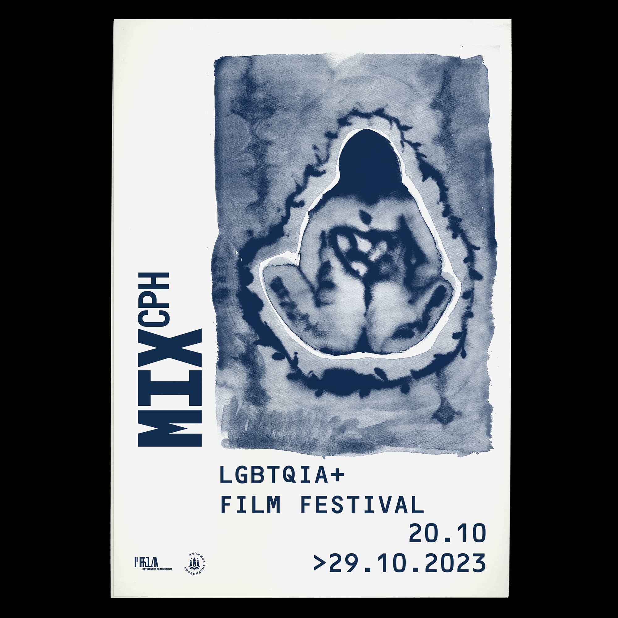


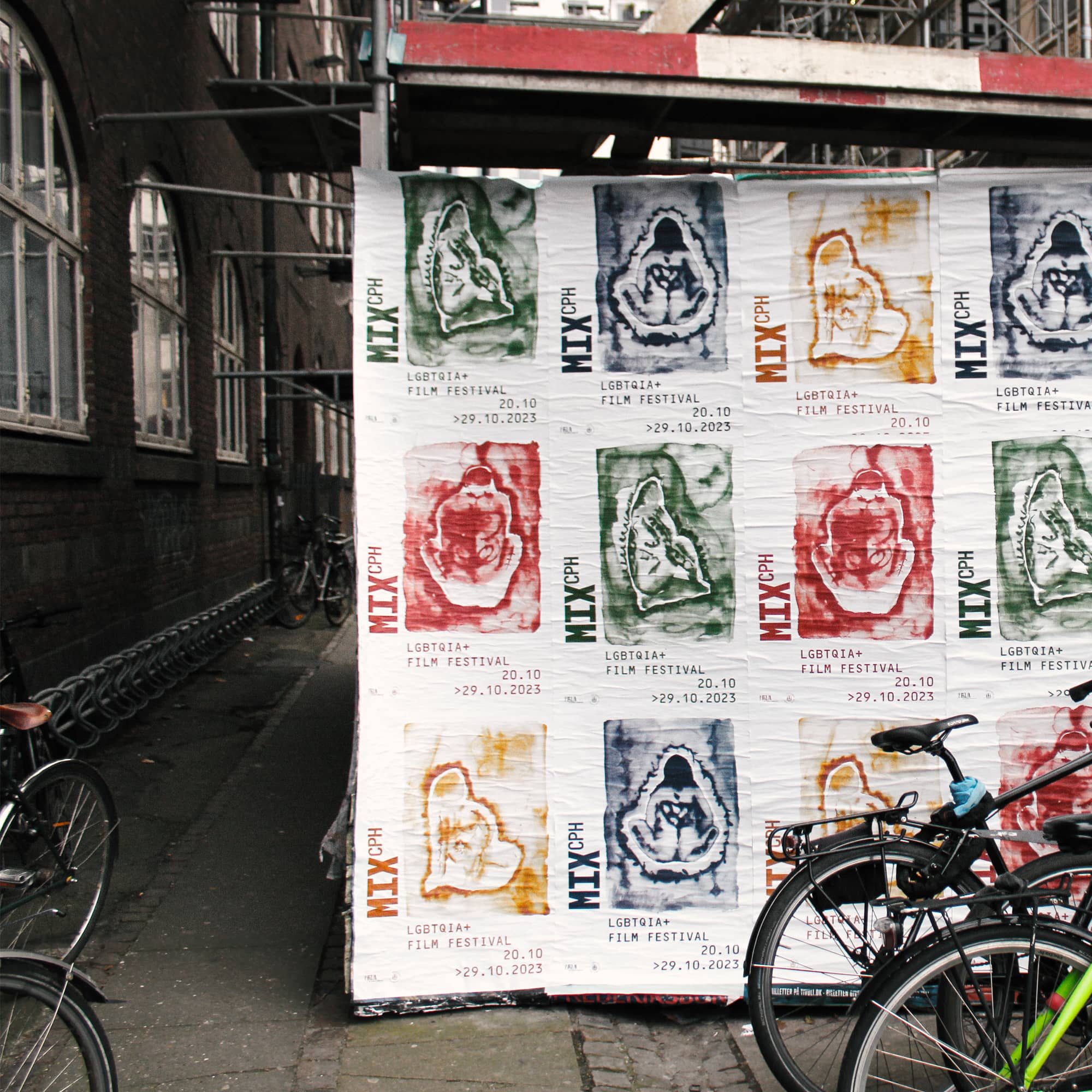
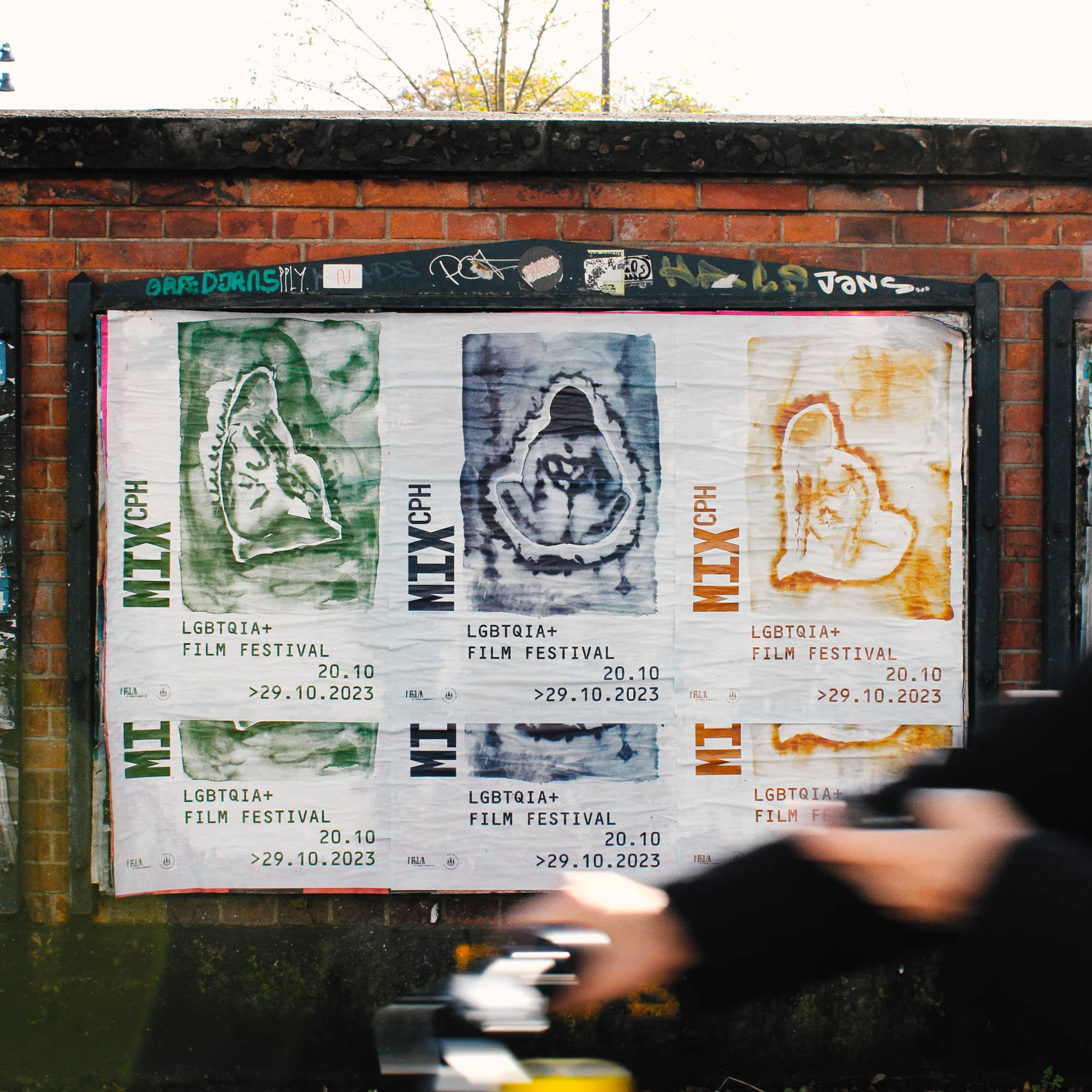
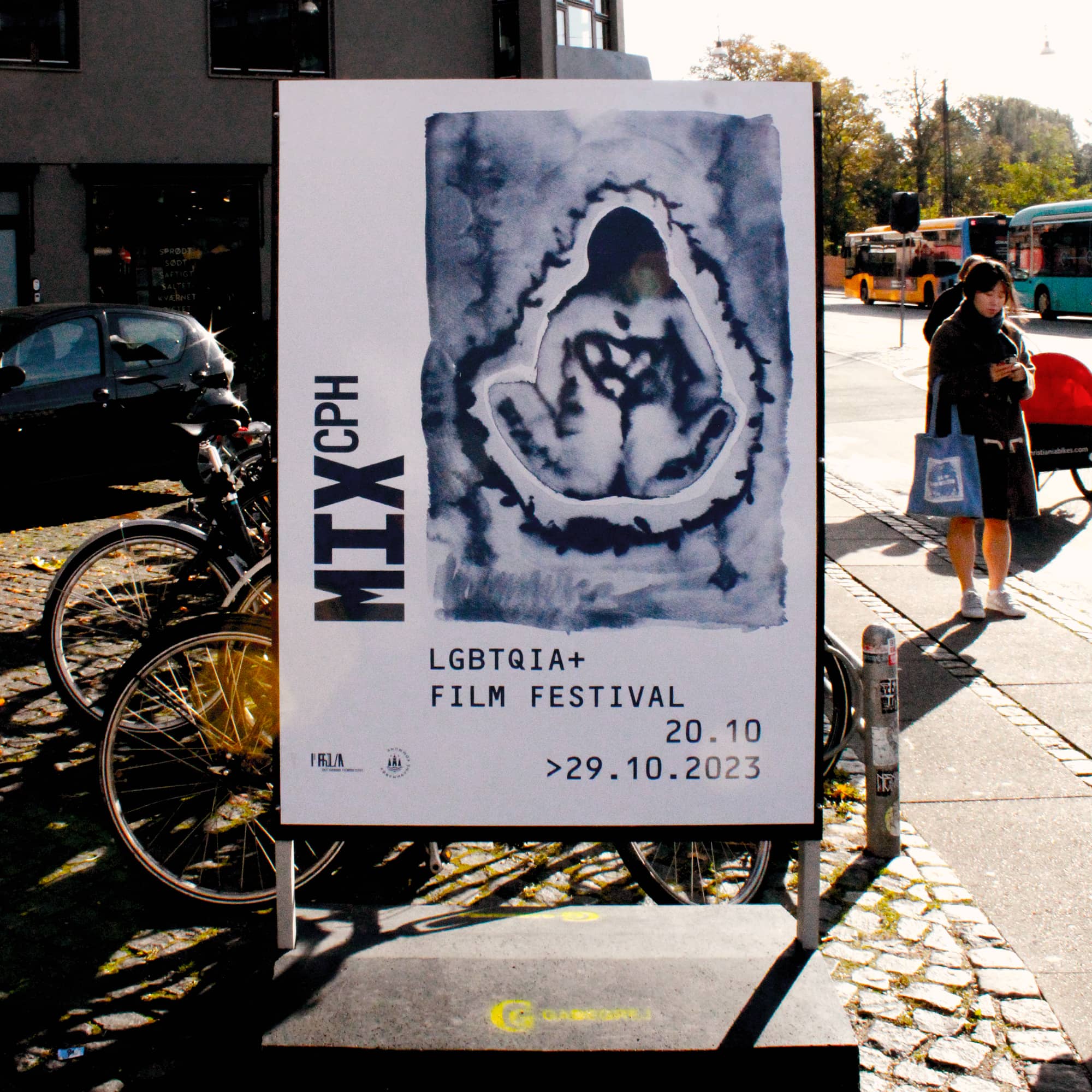
MIX CPH ‘23:
SHAPESHIFTERS
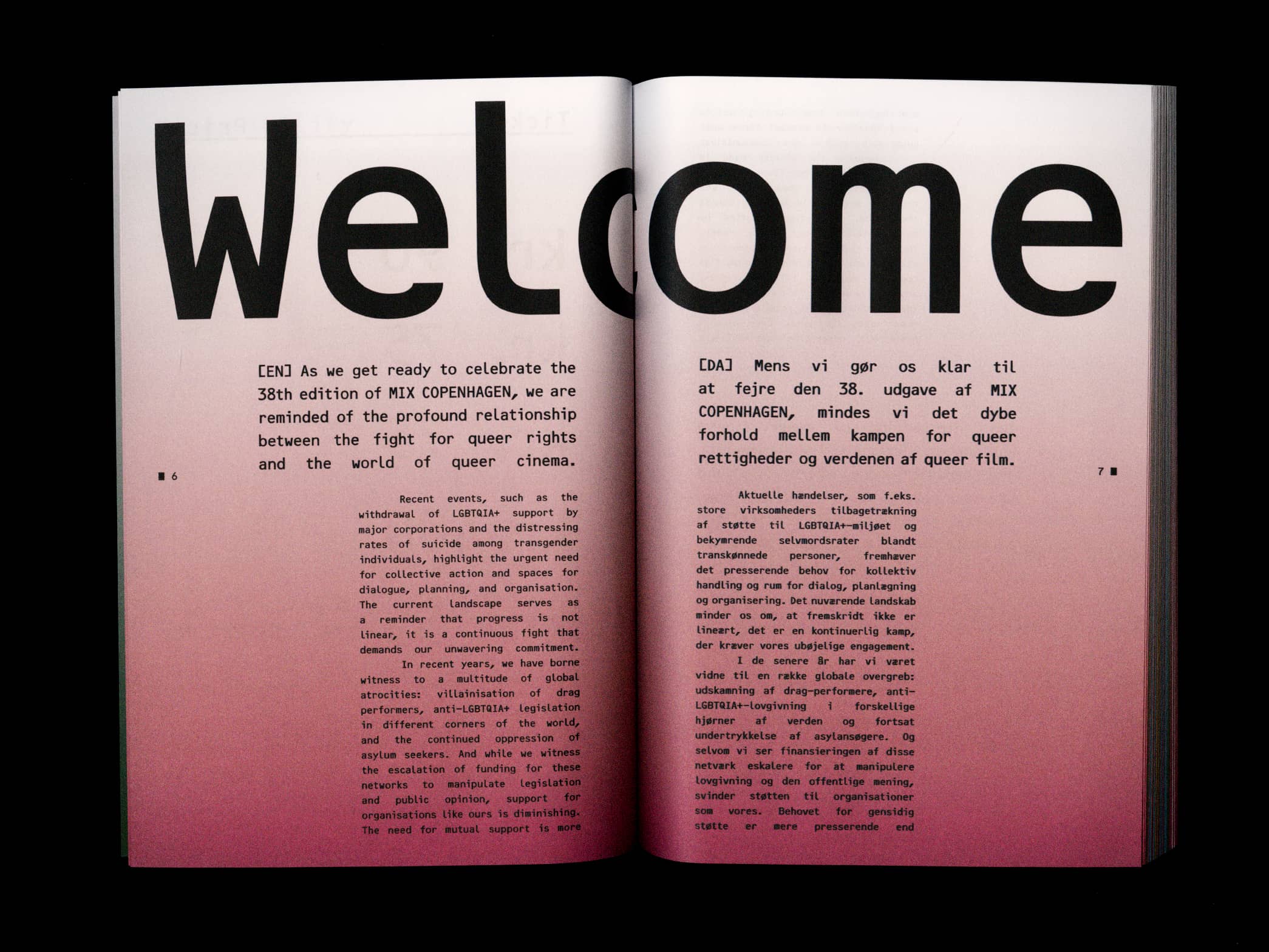
Reflecting the turmoil faced by our communities in recent years, MIX ‘23 identity reflects the feeling of grief for a world we had hoped for. A feeling that’s also recognisable in this year’s program. We wish progress was linear, that we would always move forward, but that’s not always the case.
Recent atrocities, like the villainisation of drag performers, anti-LGBTQIA+ legislations and the increasing number of incidents of violence targeting queer people, highlight the urgent need for collective action and spaces for dialogue, planning, and organisation.
Like we've done so many times before, we must shape and mould ourselves into communities capable to not only survive this reality, but push back. Let this be a reminder that our fight is a continuous effort that demands our unwavering commitment.


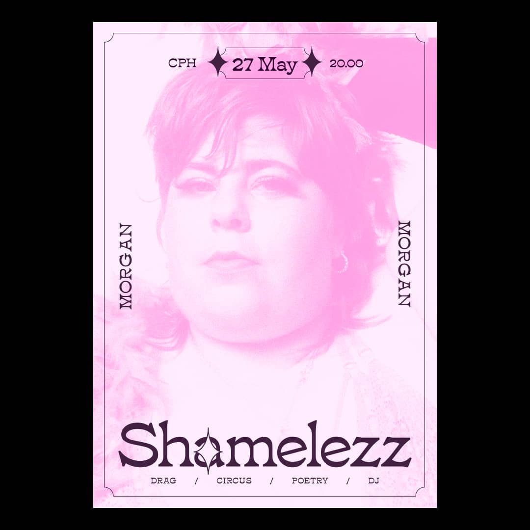

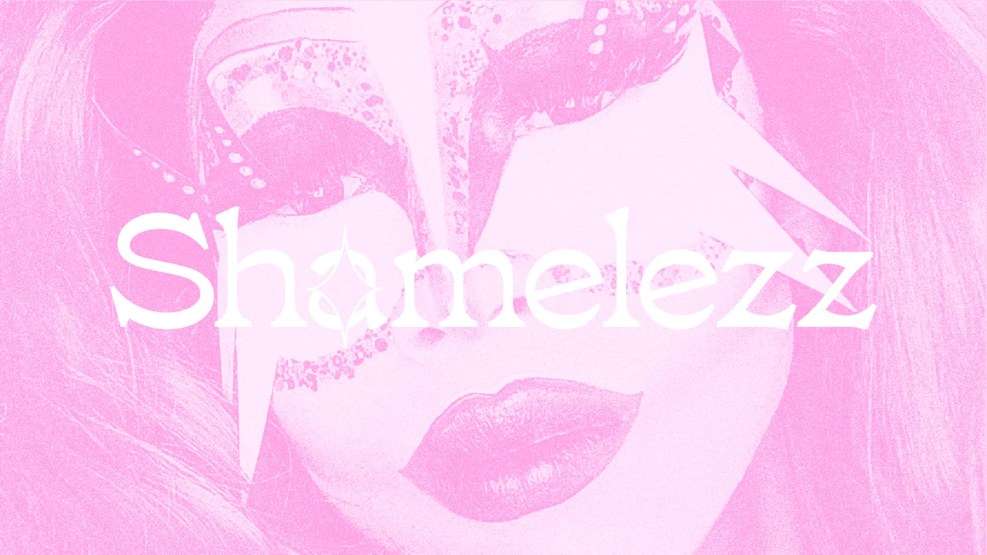
SHAMELEZZ
Some brand new visuals for Shamelezz💖, a drag and performing event in Denmark.

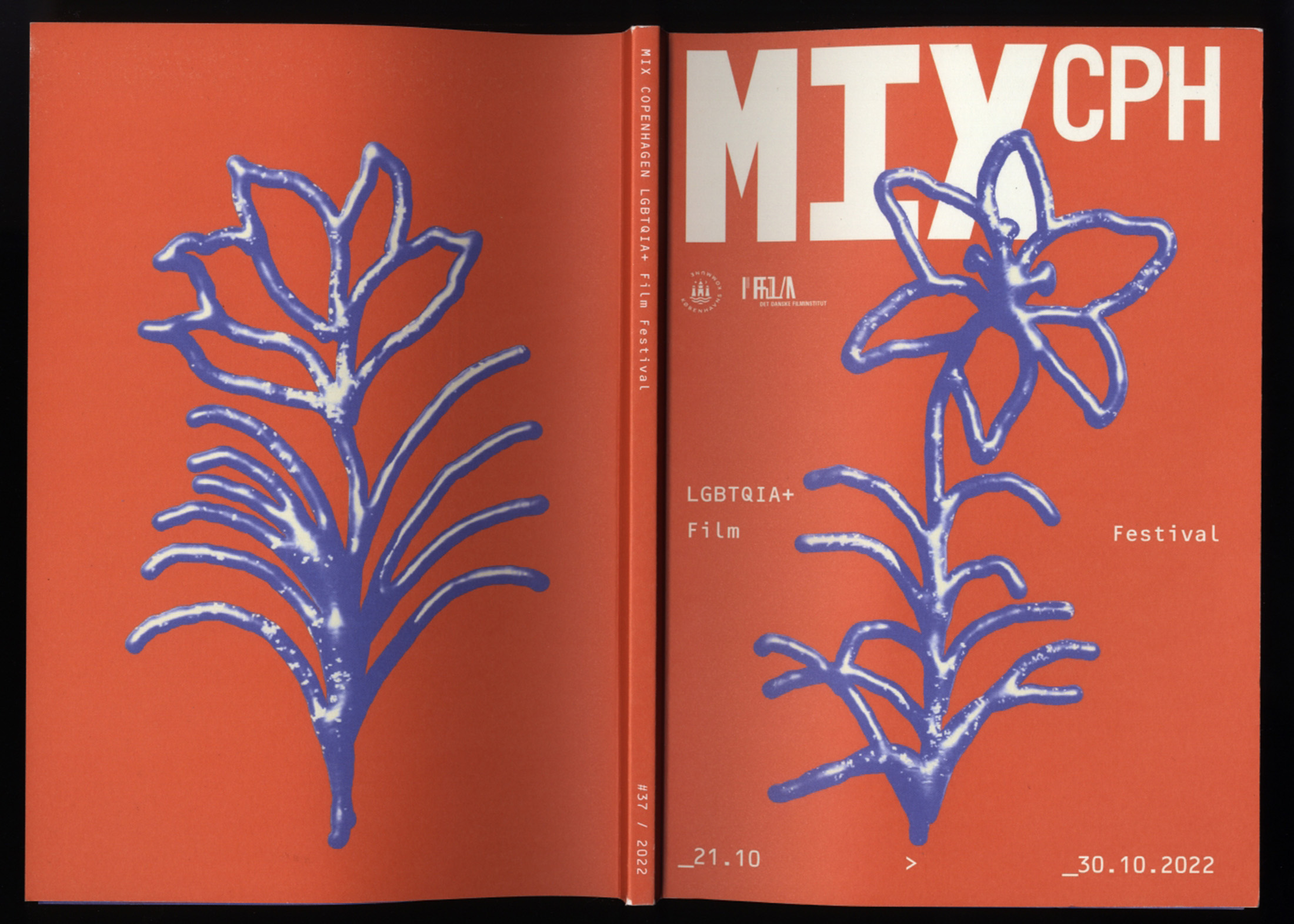
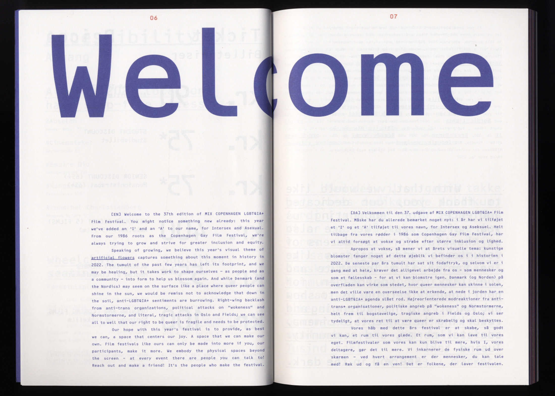

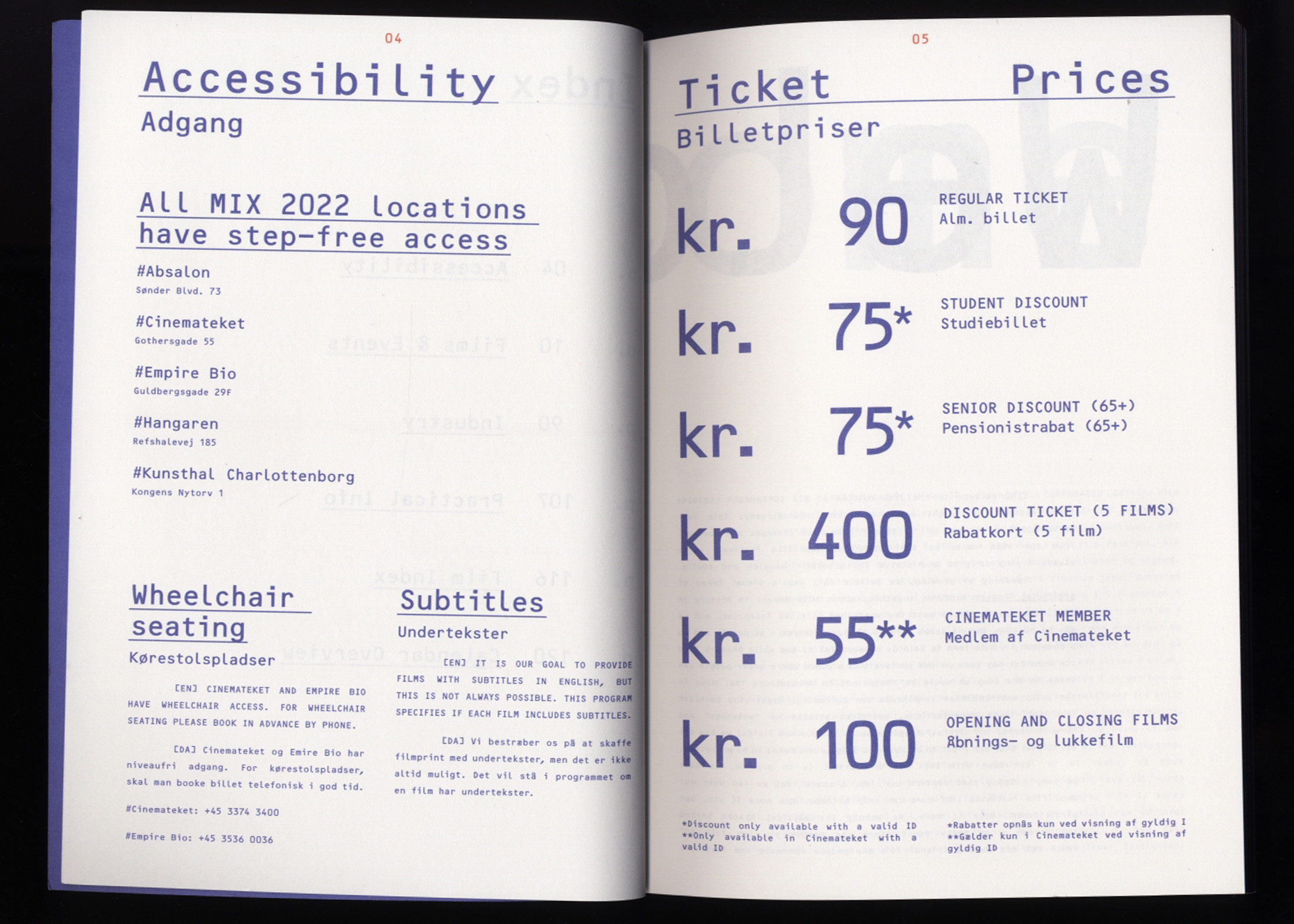
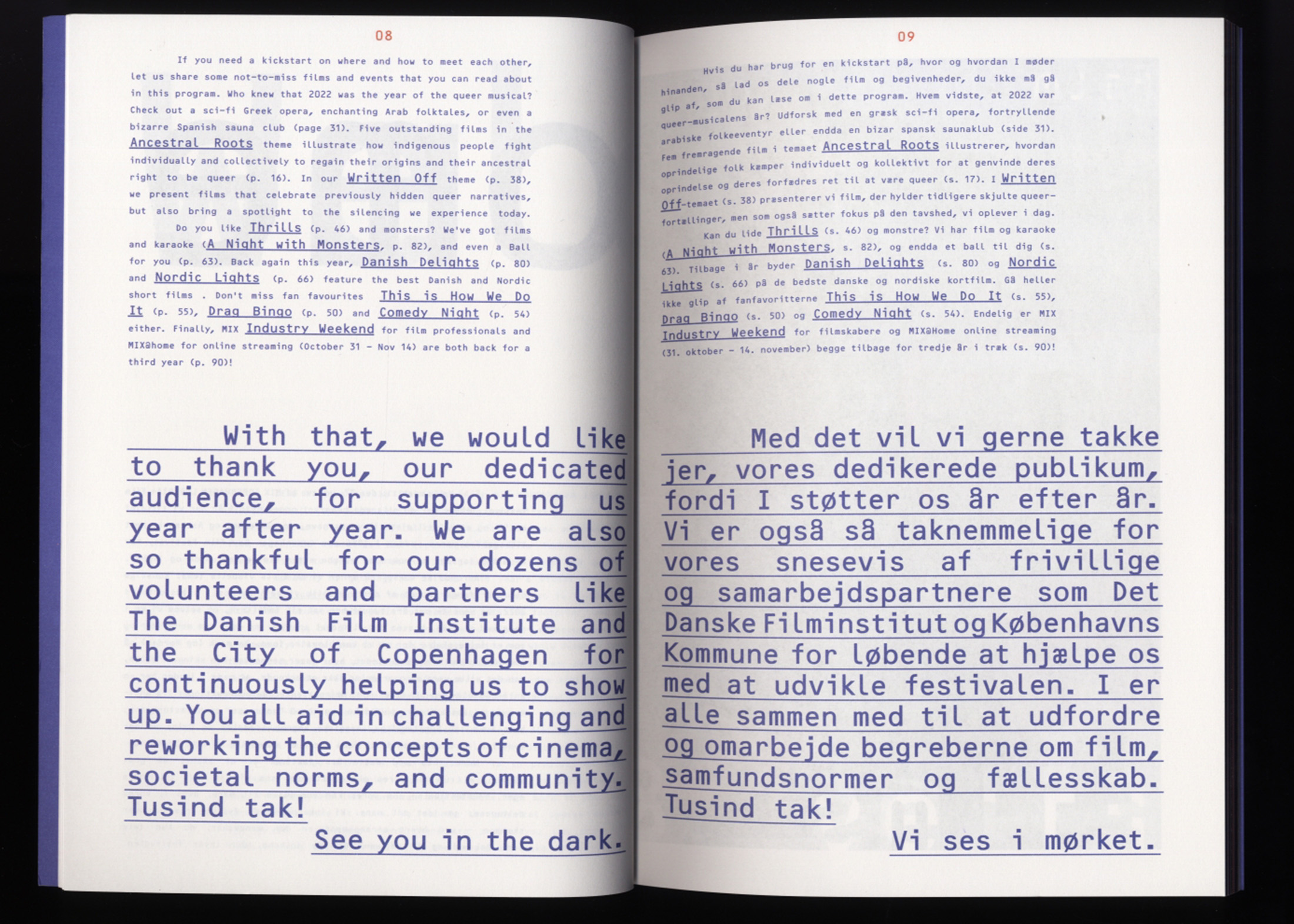
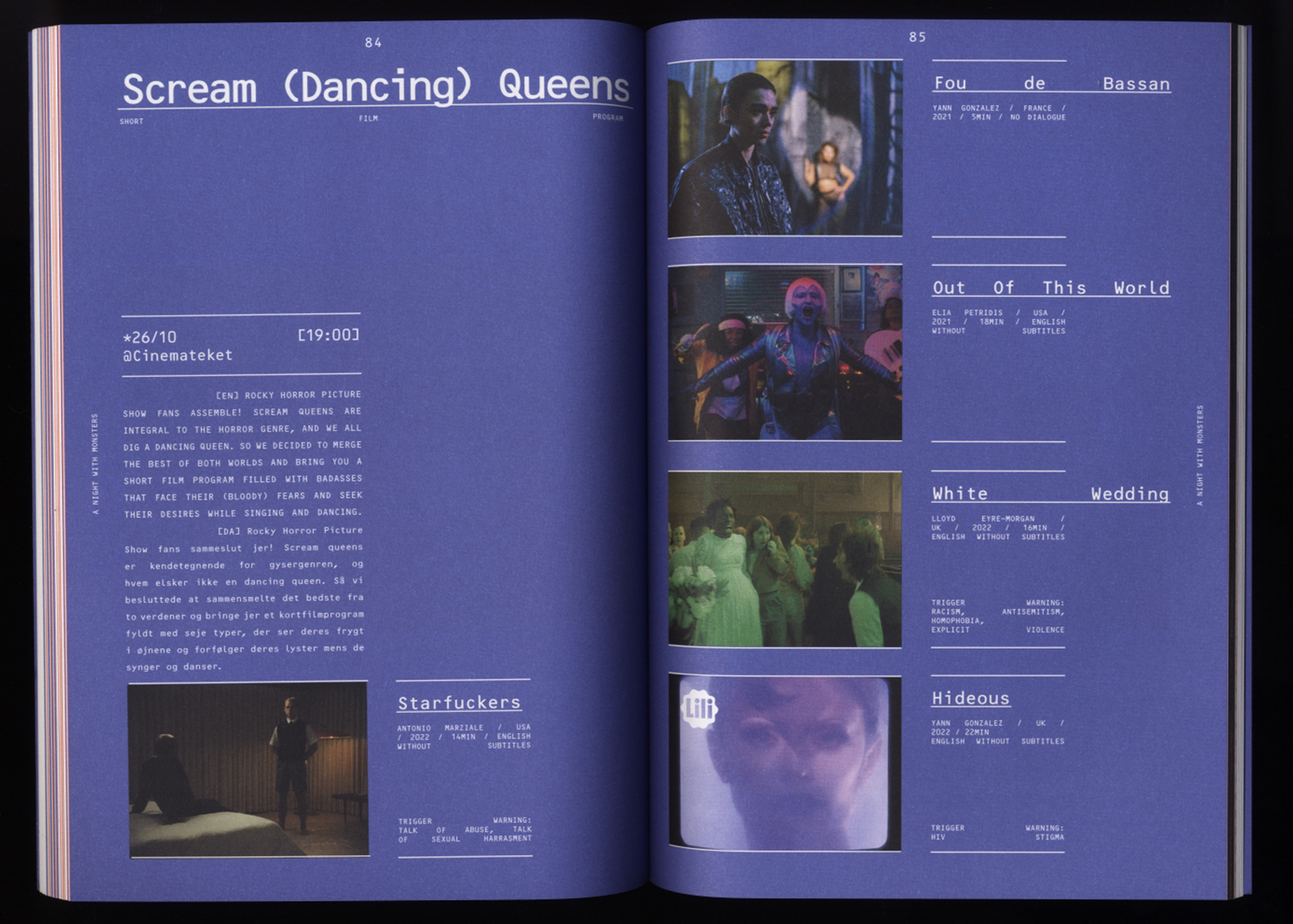
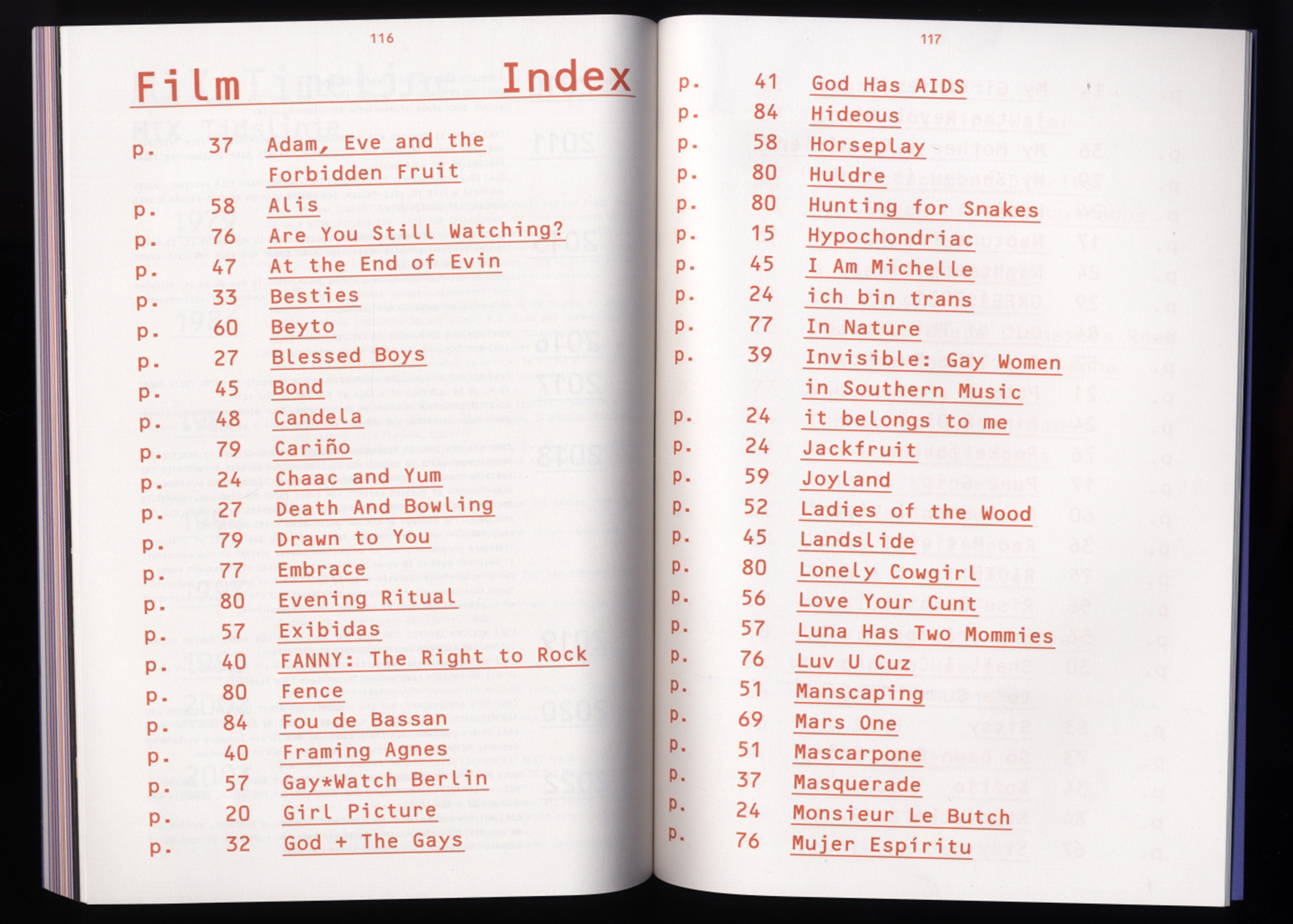
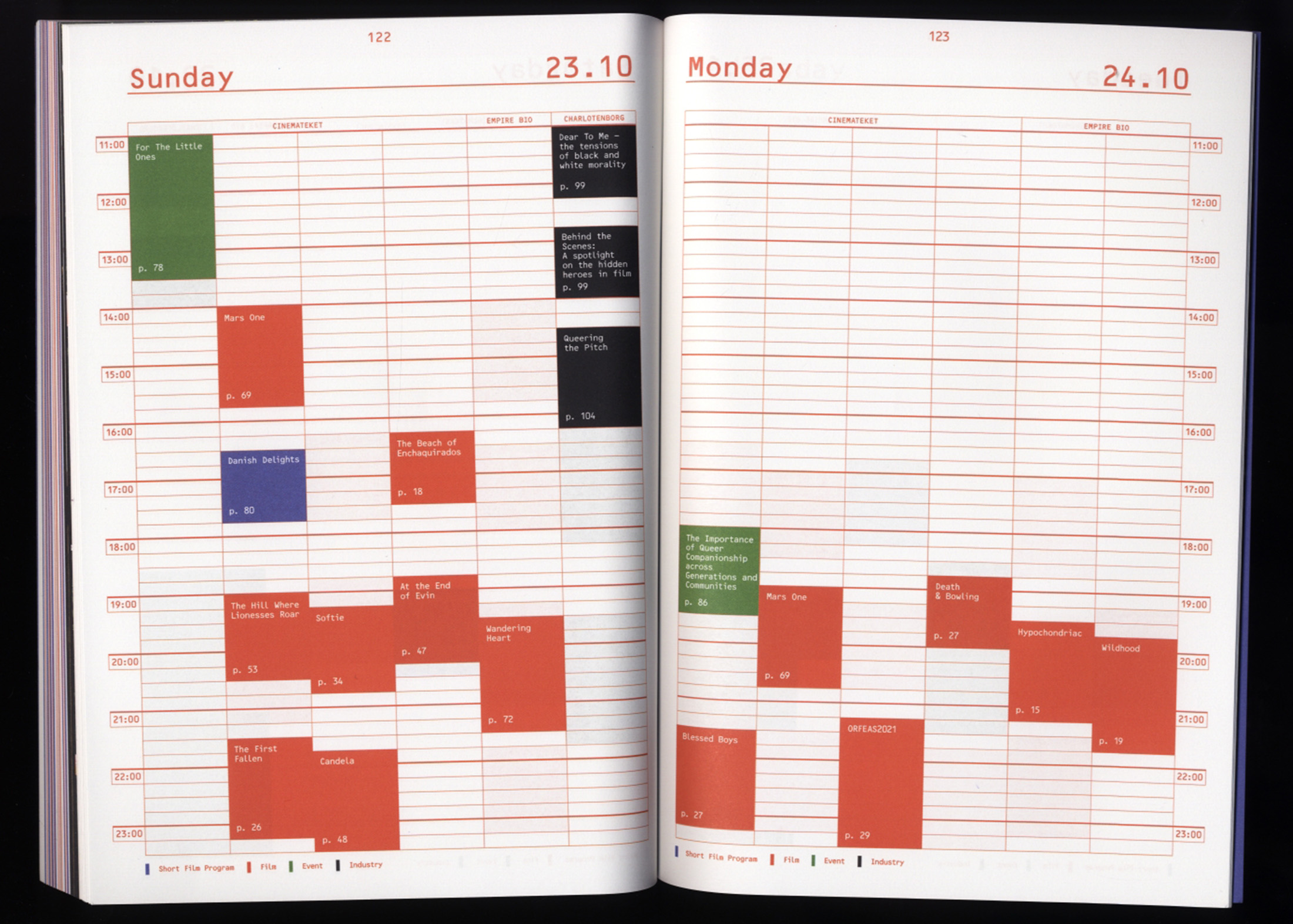
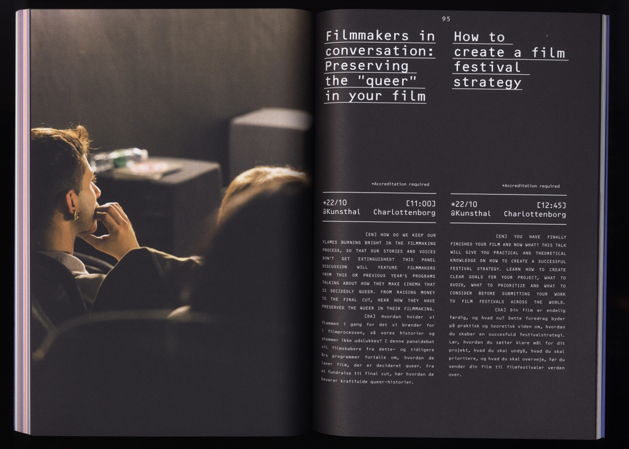
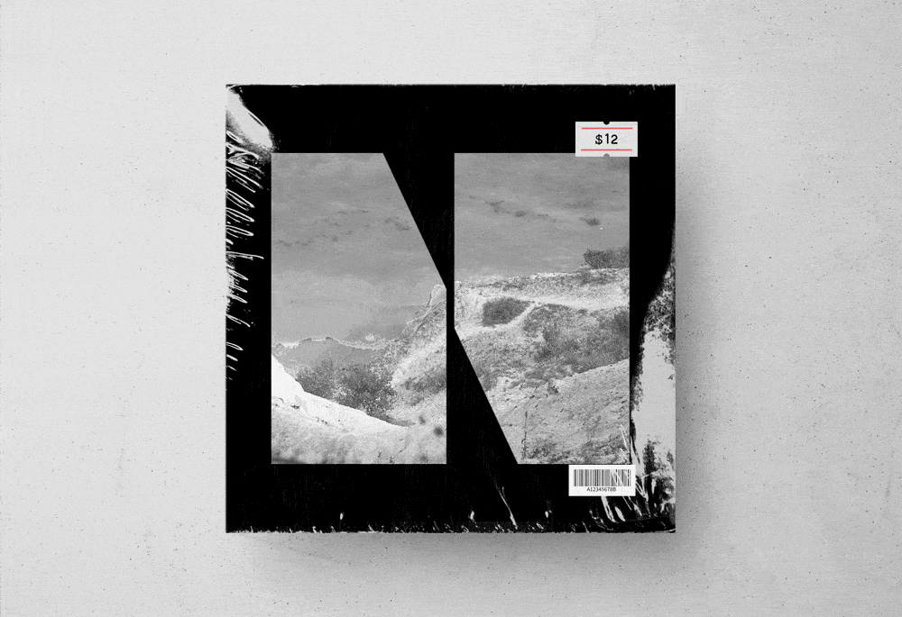
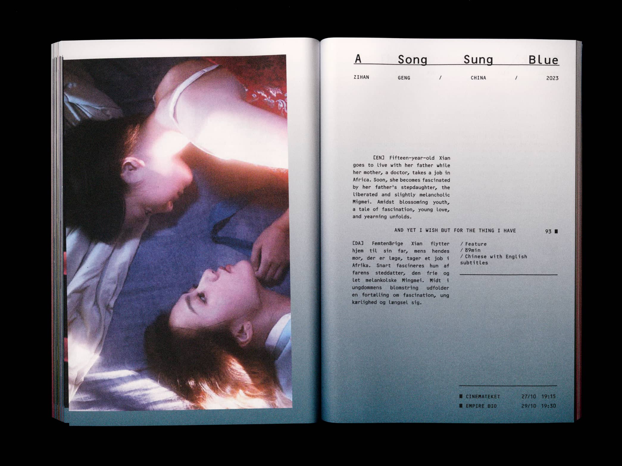
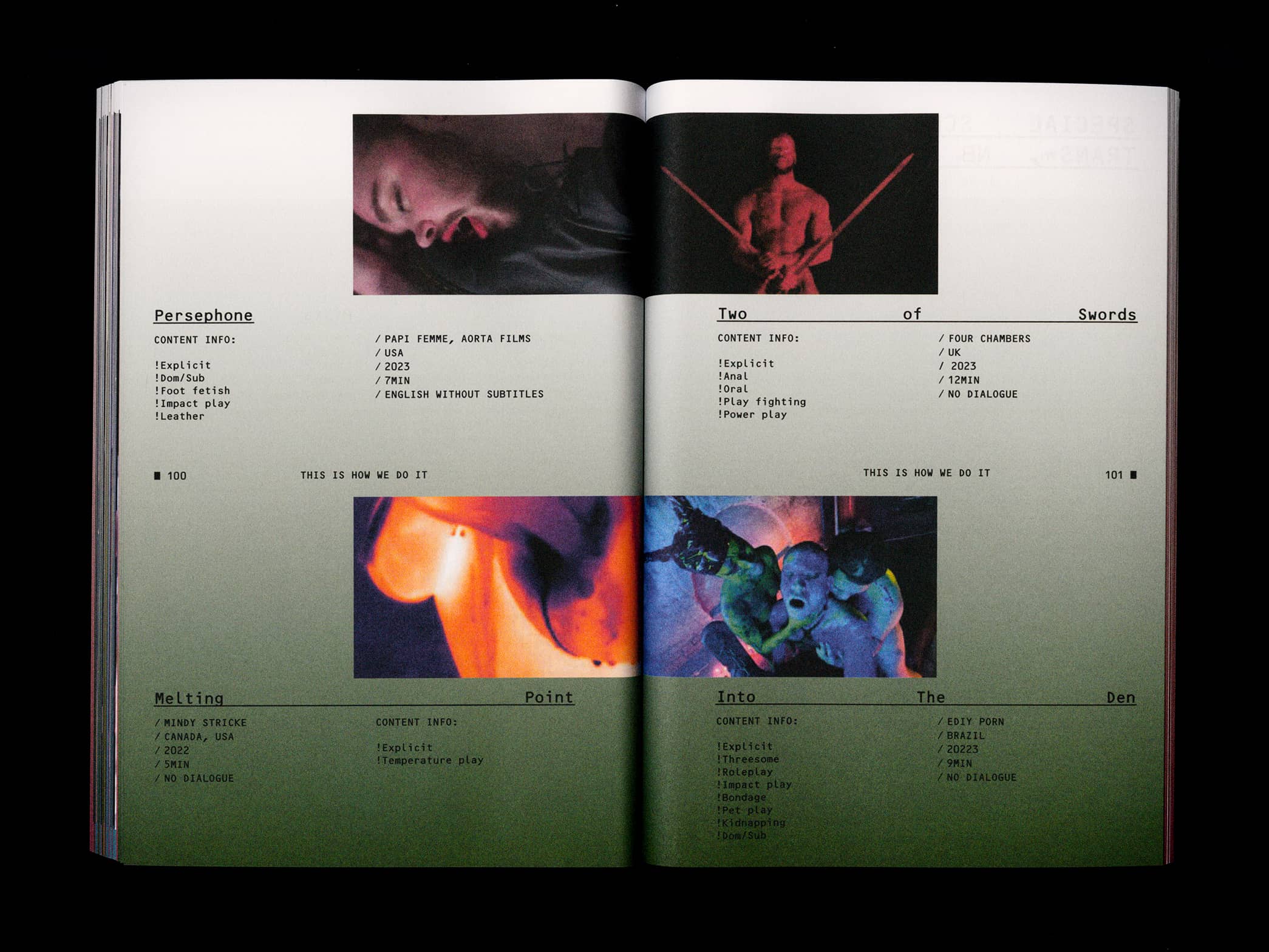
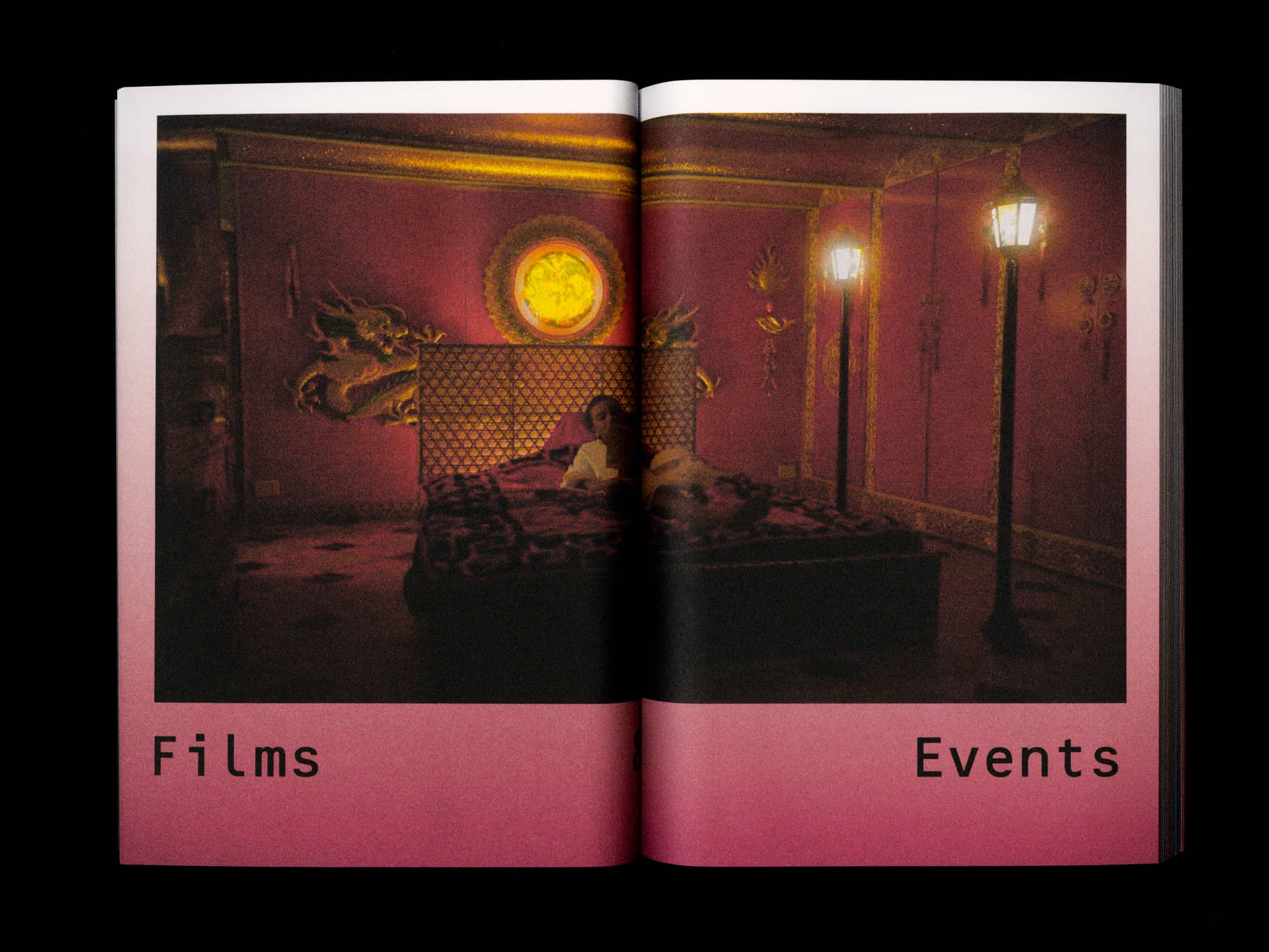
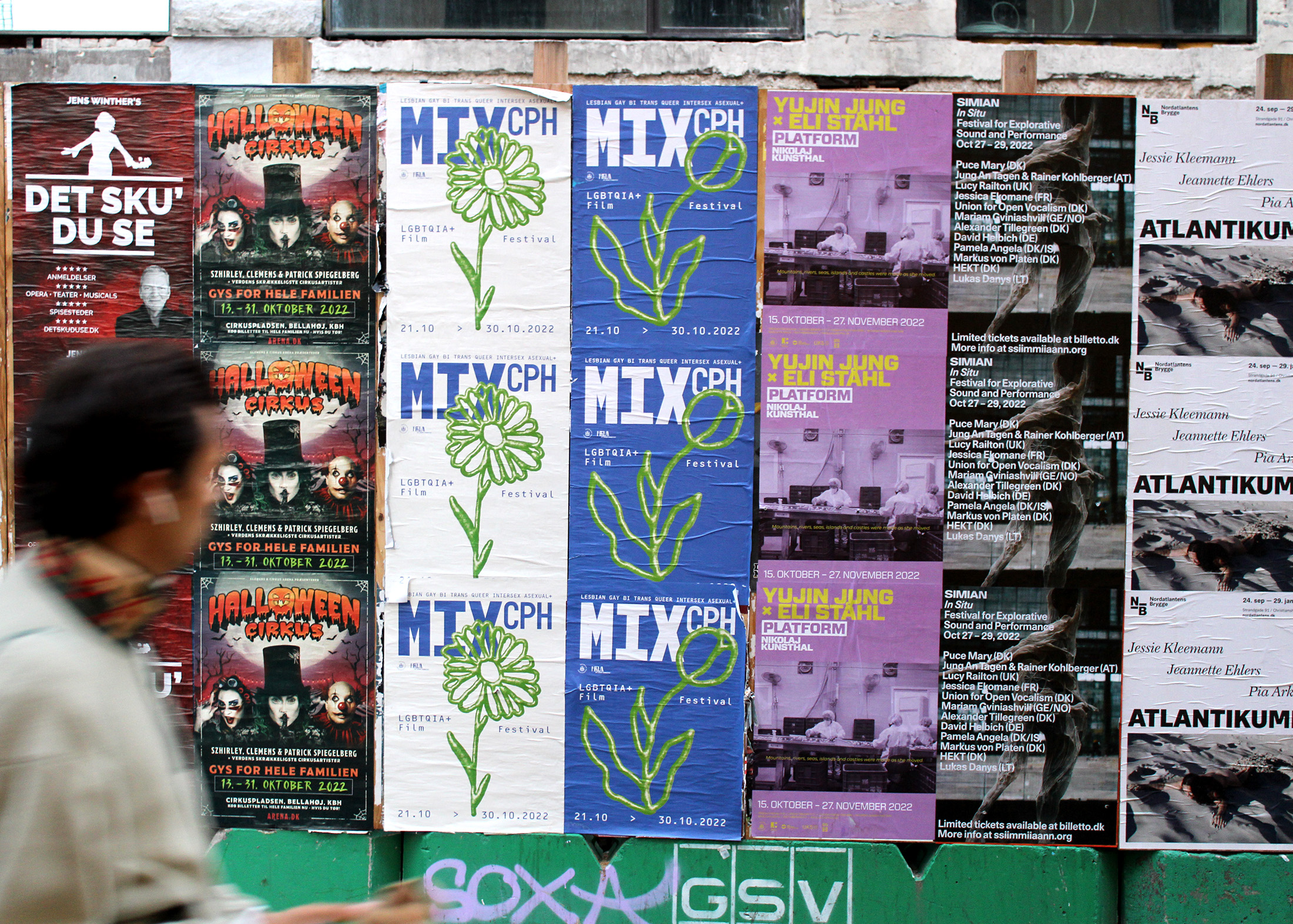
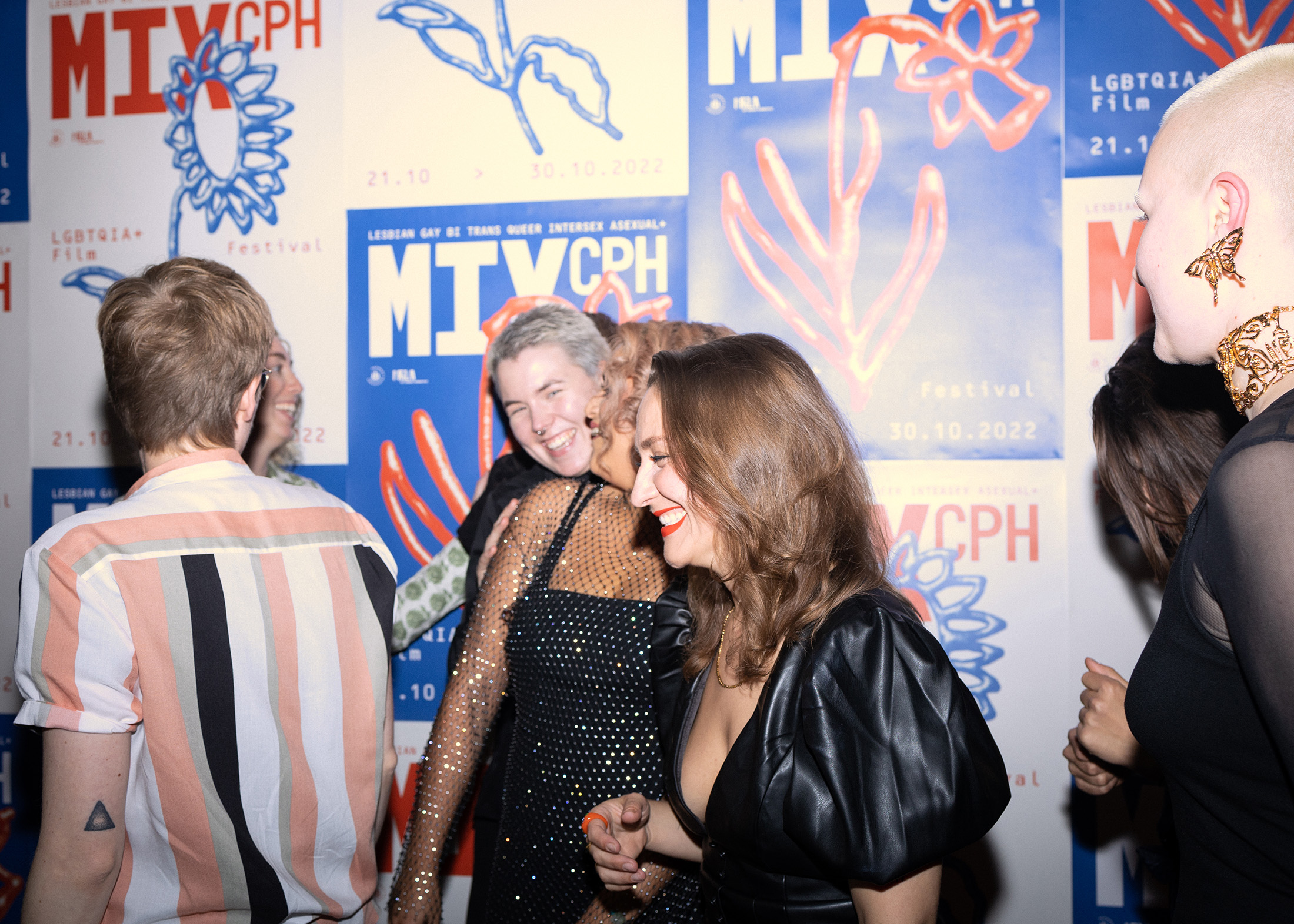
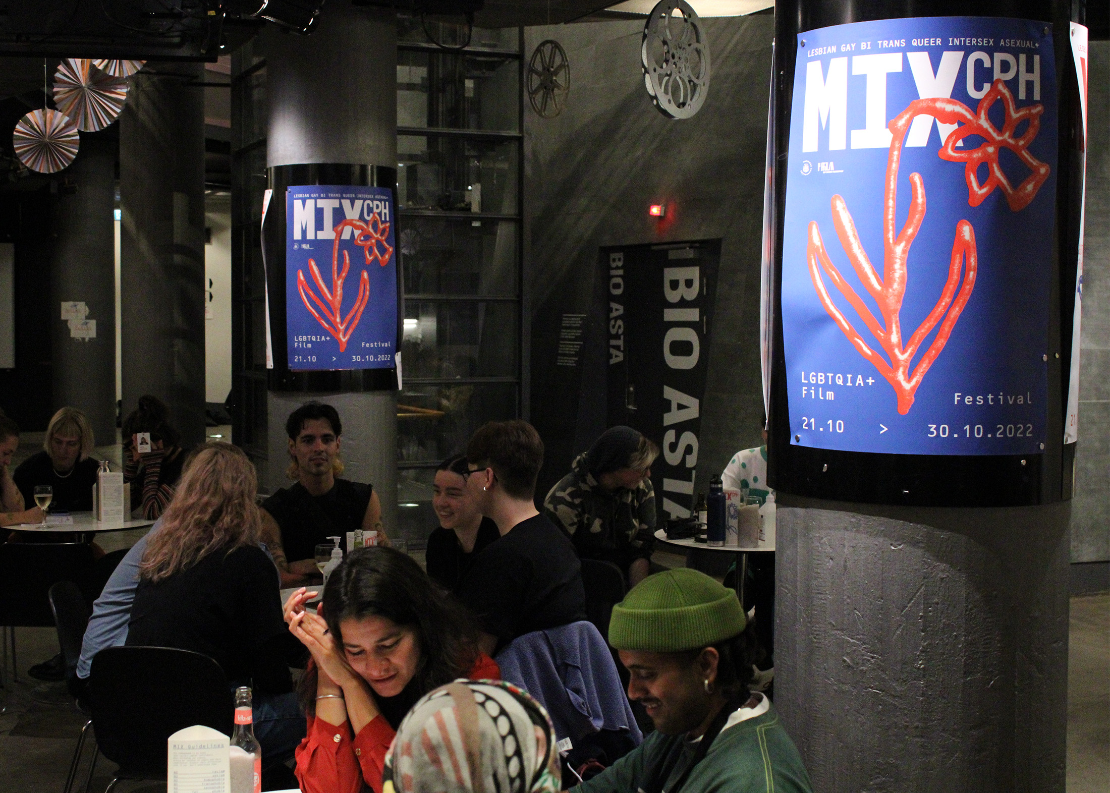
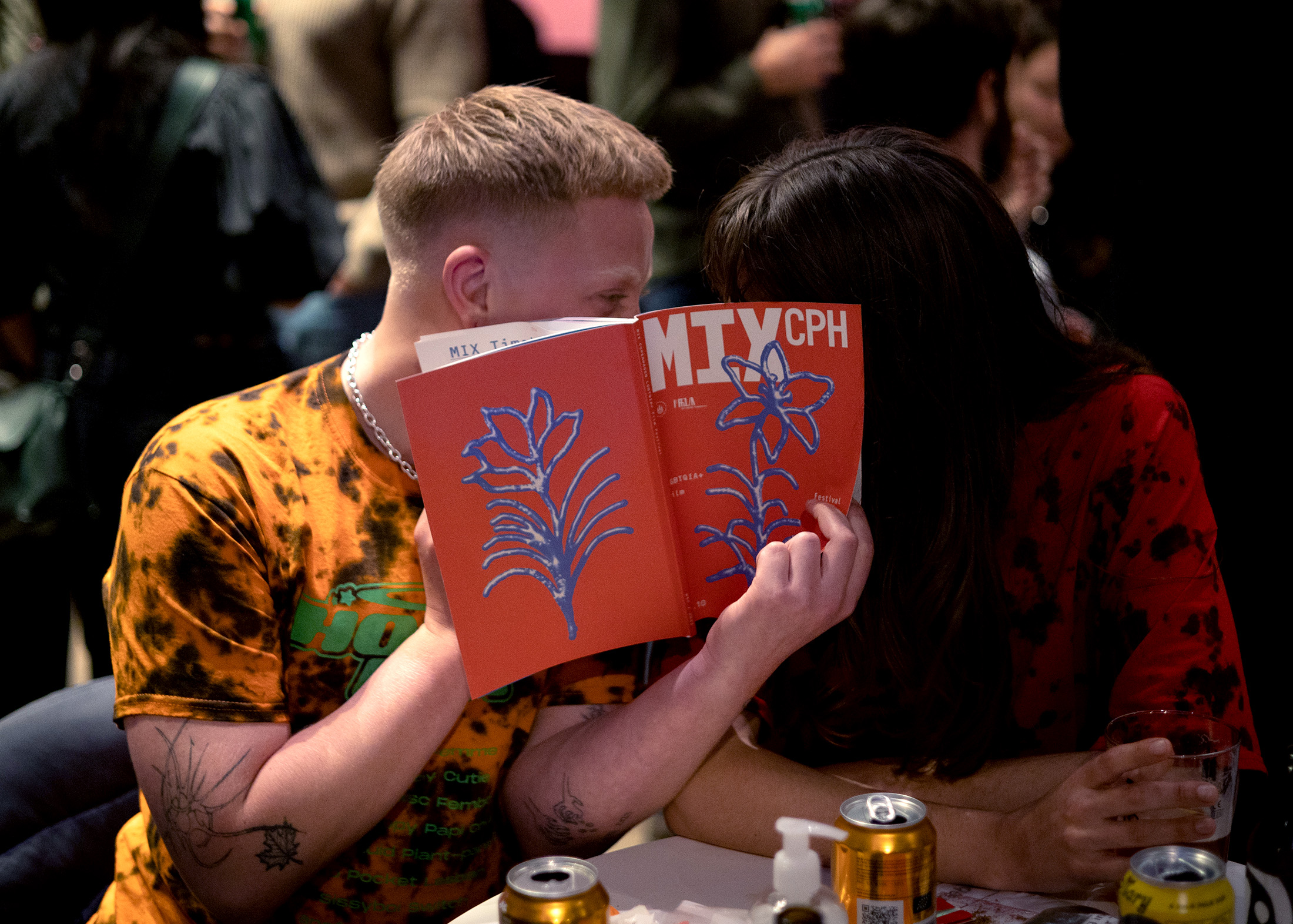
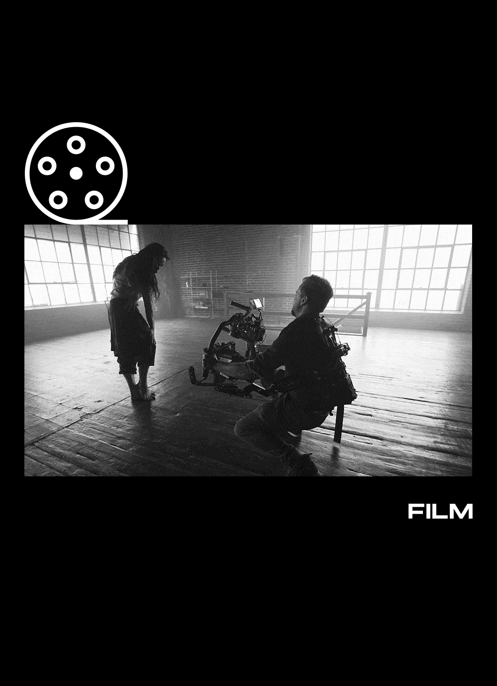
MIX CPH ‘22
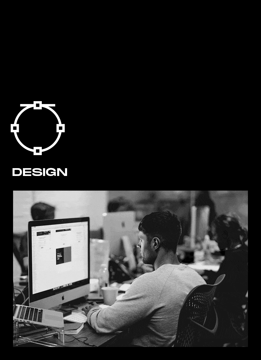
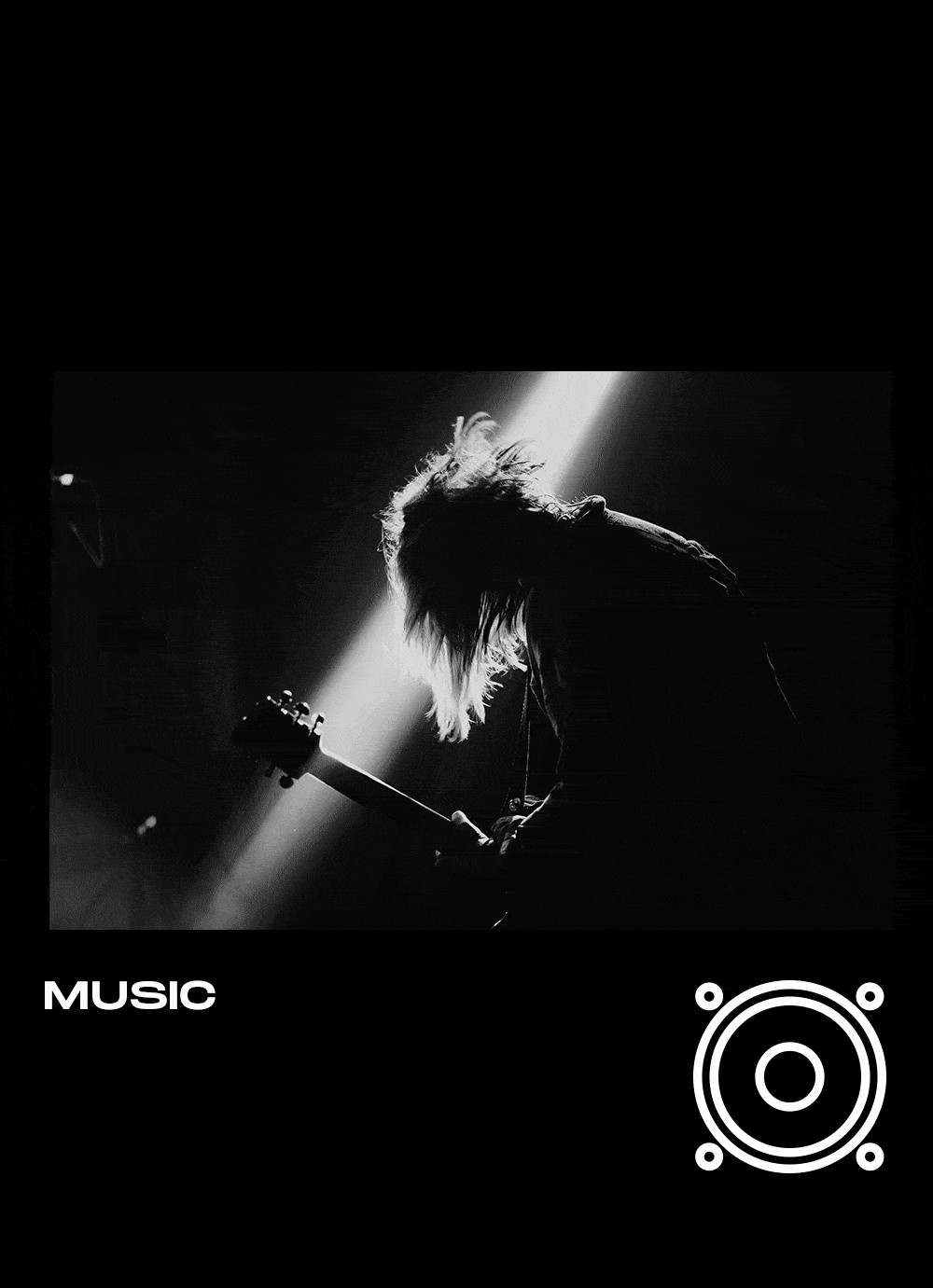
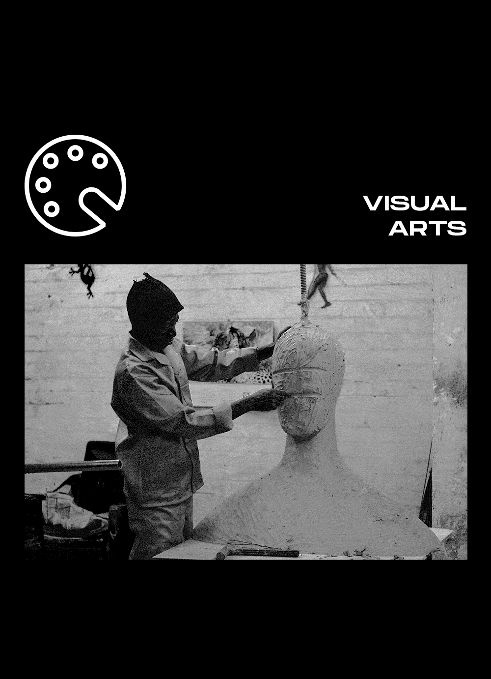
Illustration, identity and printed program for the 2022 edition of MIX CPH LGBTQIA+ Film Festival

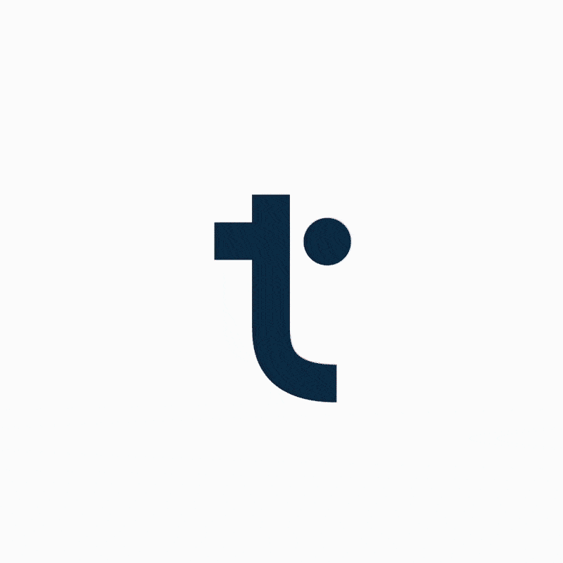


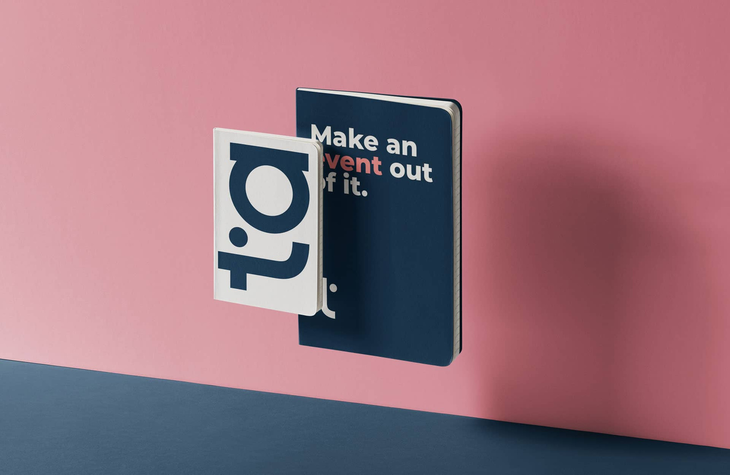
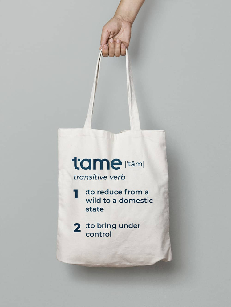

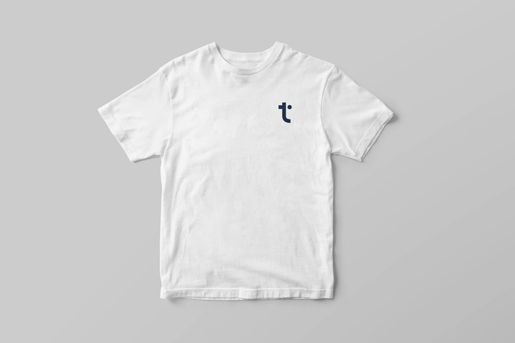
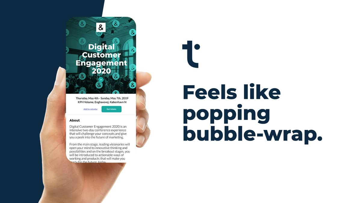

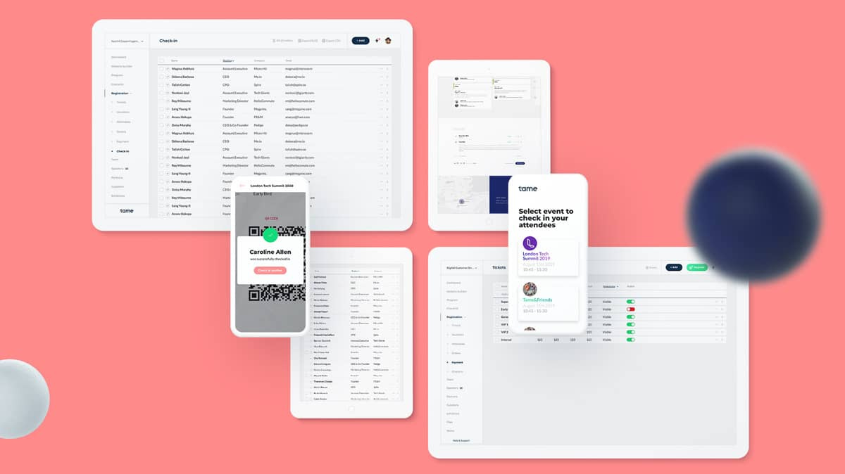
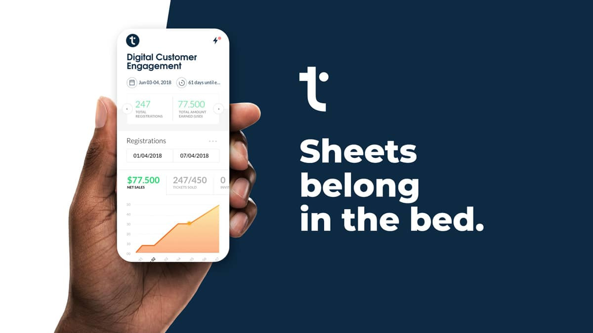
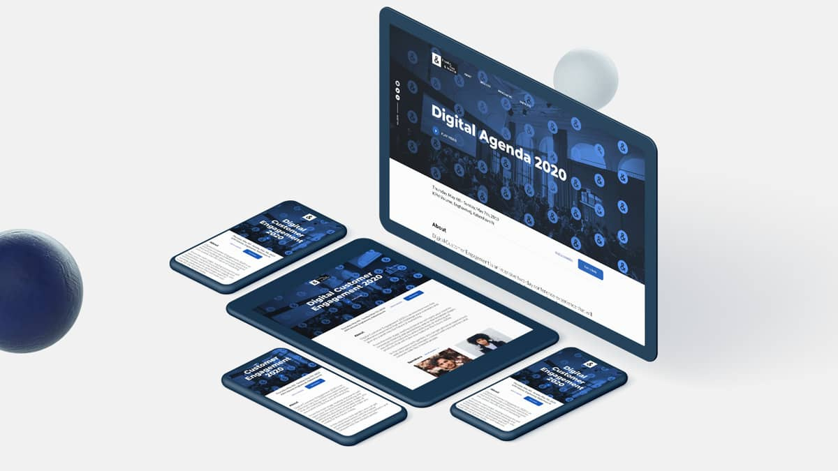
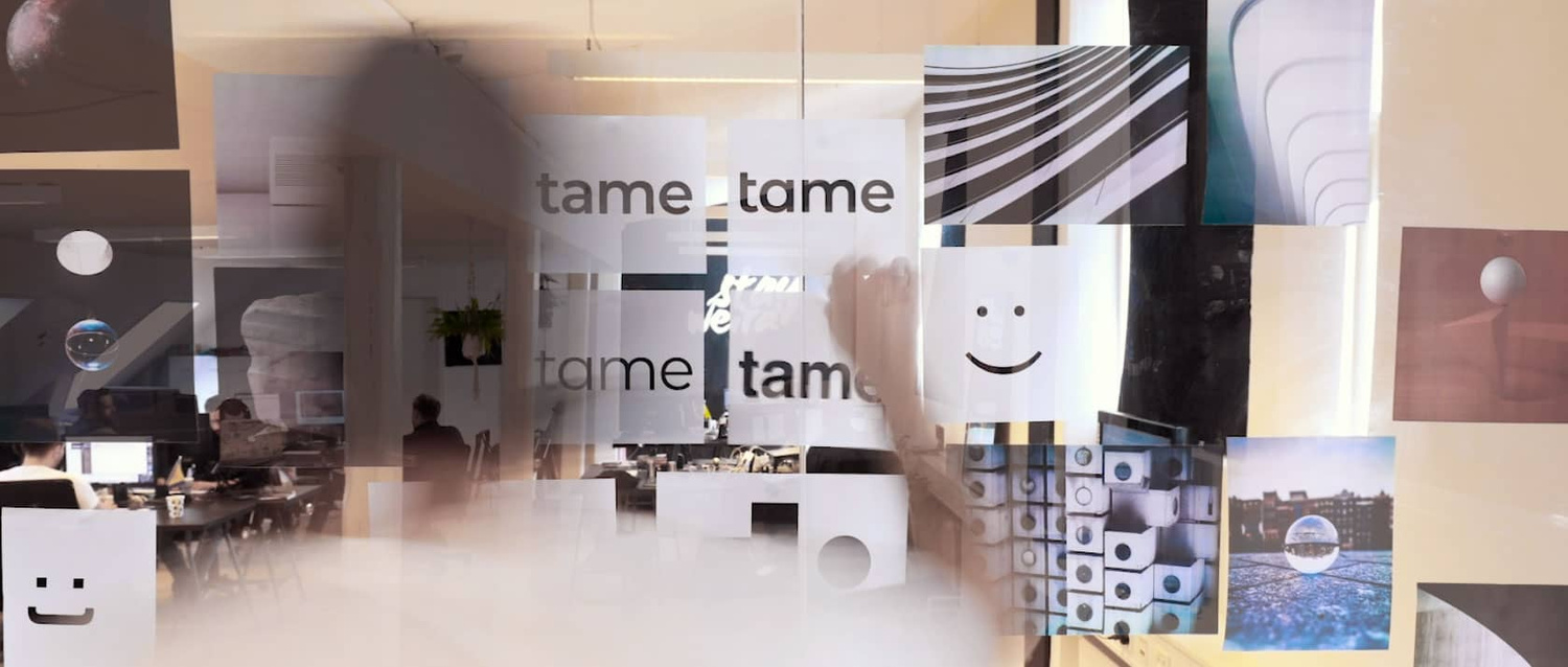
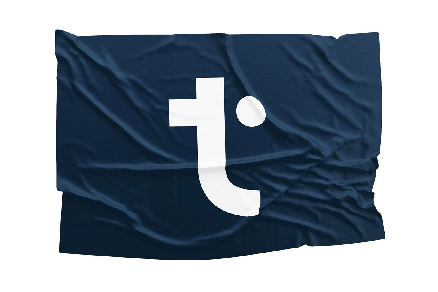
TAME
Tame is an event planning and attendee experience software.
For the visual solution, we made a smooth and solid t with the right side of the cross section transformed into a floating circle, to symbolise the freedom of creativity in contrast with the sturdiness of the block.
3D & motion
︎︎︎Jakob Chrøis
Creative direction
︎︎︎Mickey Switzer
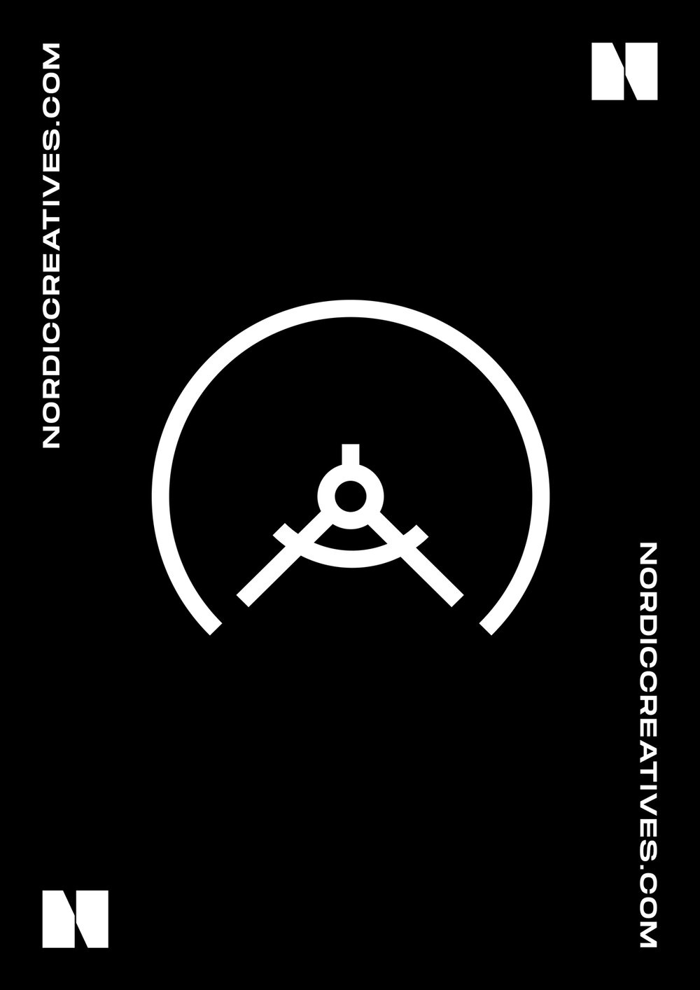
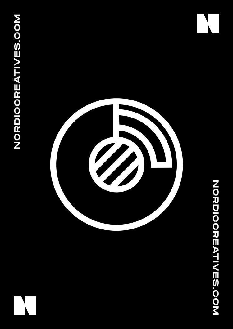
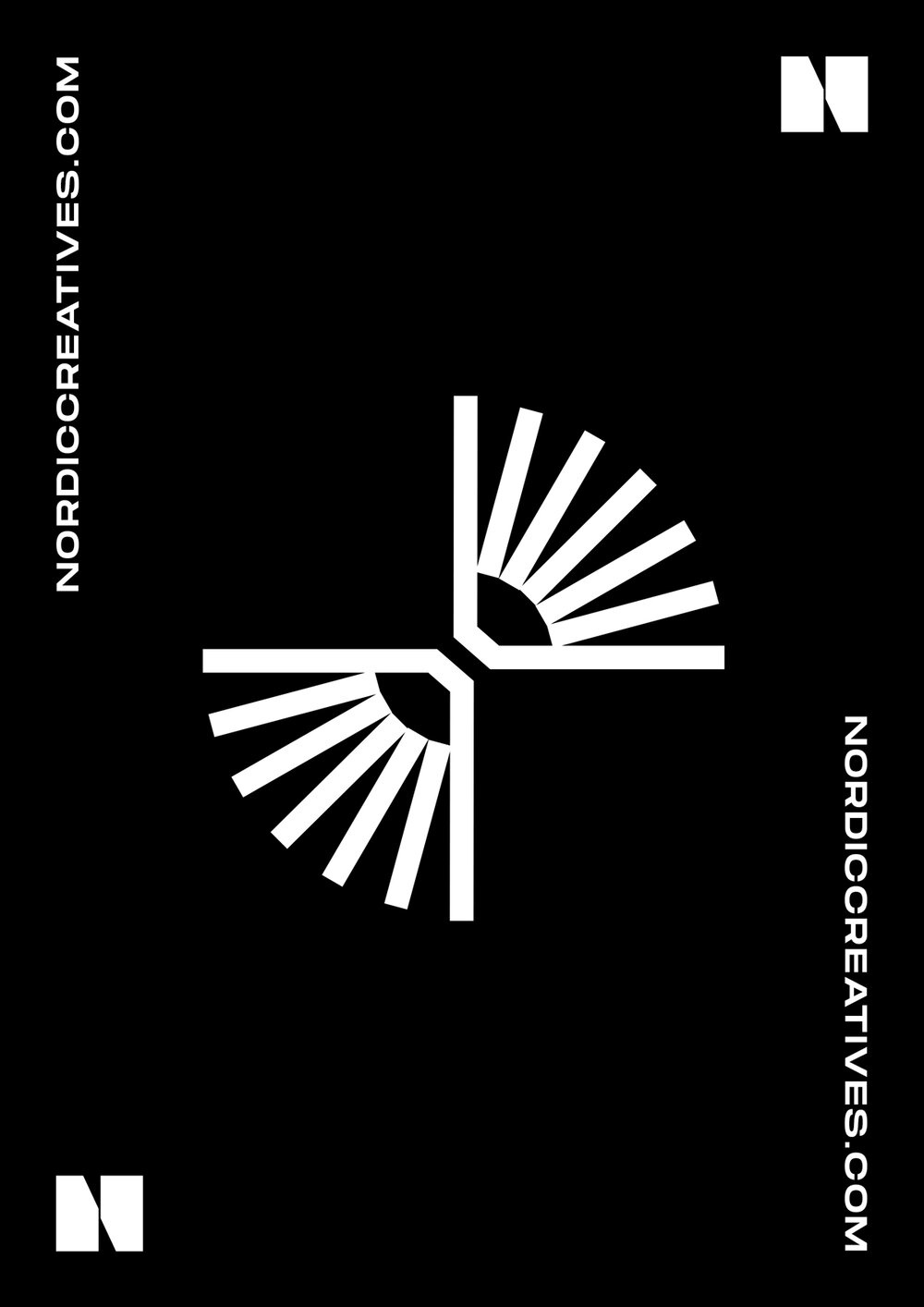
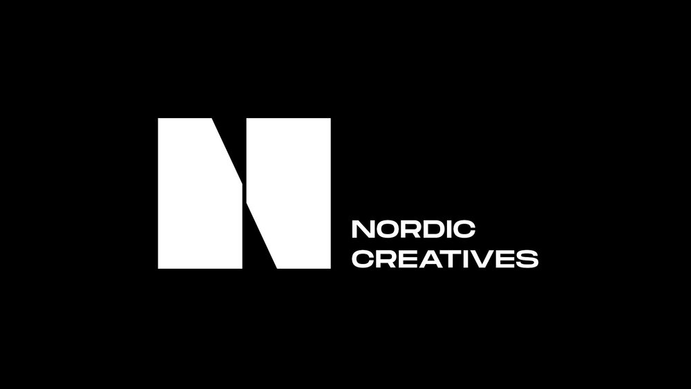
NORDIC CREATIVES
Nordic Creatives is a content platform with the intention of connecting and strengthening the creative industries in the Nordics.
The approved direction for the logo takes inspiration from the bulky and geometric visuals of contemporary nordic architecture.
For the visual solution we aimed to evoke the grandness and minimalism of nordic design and architecture, highlighting the contrast between bulky shapes and delicate balance.
Creative direction
︎︎︎Mickey Switze
︎︎︎Mickey Switze